Choosing the right colors for your home can be a daunting task. You want hues that not only reflect your style but also stand the test of time without becoming tiresome. At Walczak Design and Build, we understand the importance of selecting colors that you’ll love for years to come. Here are some tips to help you choose the perfect palette for your home.
1. Understand Color Psychology
Colors have a significant impact on our emotions and moods. Understanding the psychology behind colors can help you create spaces that feel right. For instance, blues and greens are calming and work well in bedrooms and bathrooms, while yellows and oranges are energizing and great for kitchens and living areas.
- Warm vs. Cool Colors: Warm colors like red, orange, and yellow create coziness and intimacy. Cool colors like blue and green evoke calmness and relaxation.
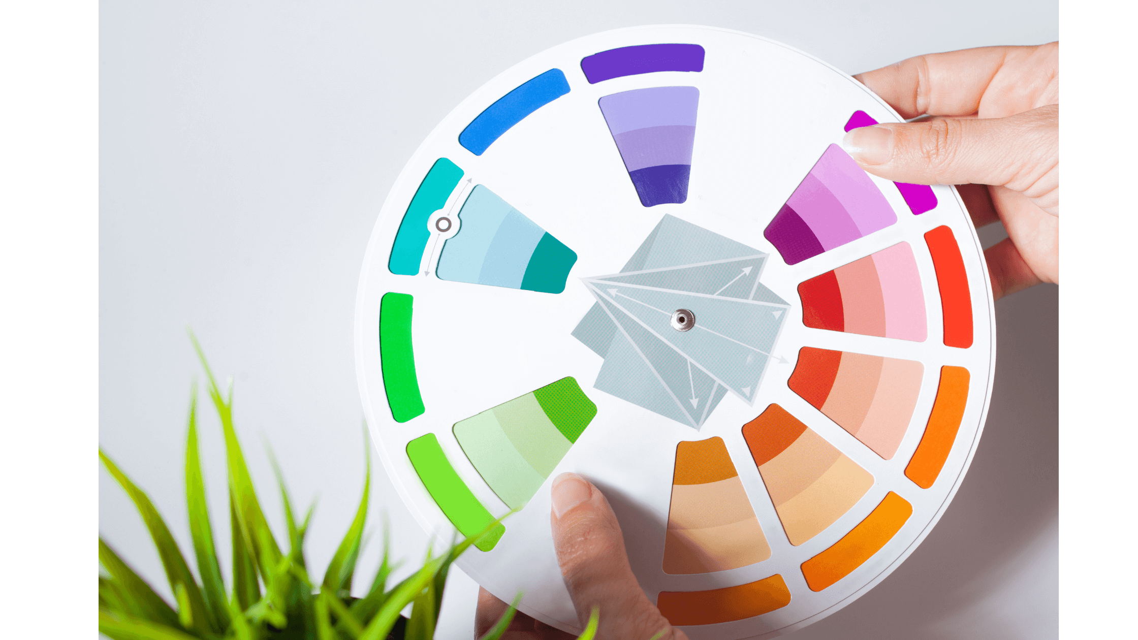
- Complementary Colors: Complementary colors, opposite each other on the color wheel (e.g., blue and orange, purple and yellow), create a vibrant, dynamic look, adding visual interest to any room.
- Analogous Colors: Analogous colors, next to each other on the color wheel (e.g., blue and green, red and orange), create a harmonious and cohesive appearance.
2. Look in Your Closet
When choosing colors for your home, look at your closet to see what colors you naturally gravitate towards. Your wardrobe often reflects your style and the hues that make you feel comfortable and happy. This can be a great starting point for selecting colors that you’ll love in your living spaces.

3. Consider Neutrals for Larger Areas
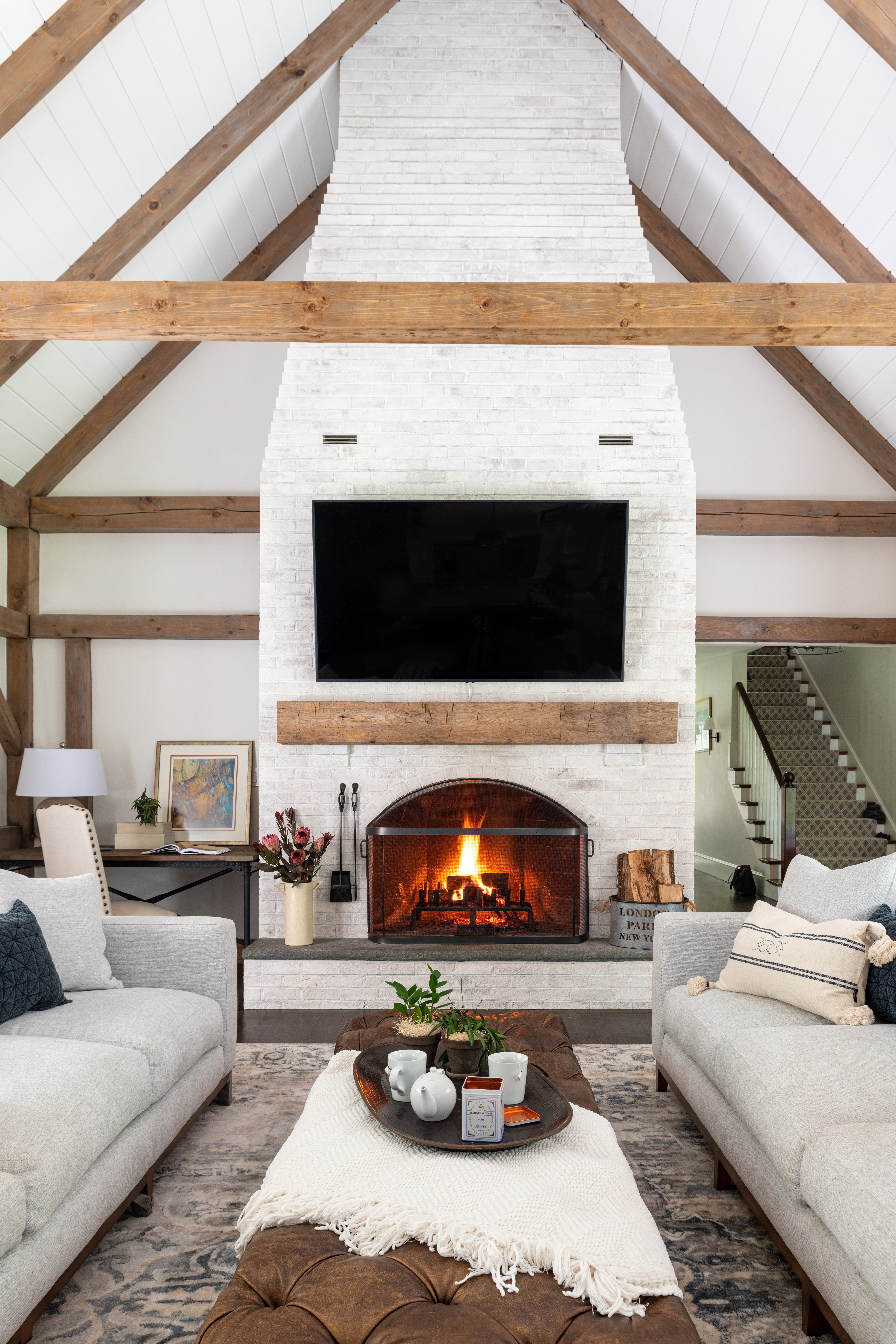
Neutral colors like beige, gray, and white are timeless and versatile. They provide a perfect backdrop for any style and allow you to change accents and accessories without needing a full repaint. Using neutrals for walls, floors, and larger pieces of furniture can keep your space feeling fresh and adaptable.
4. Incorporate Accent Colors
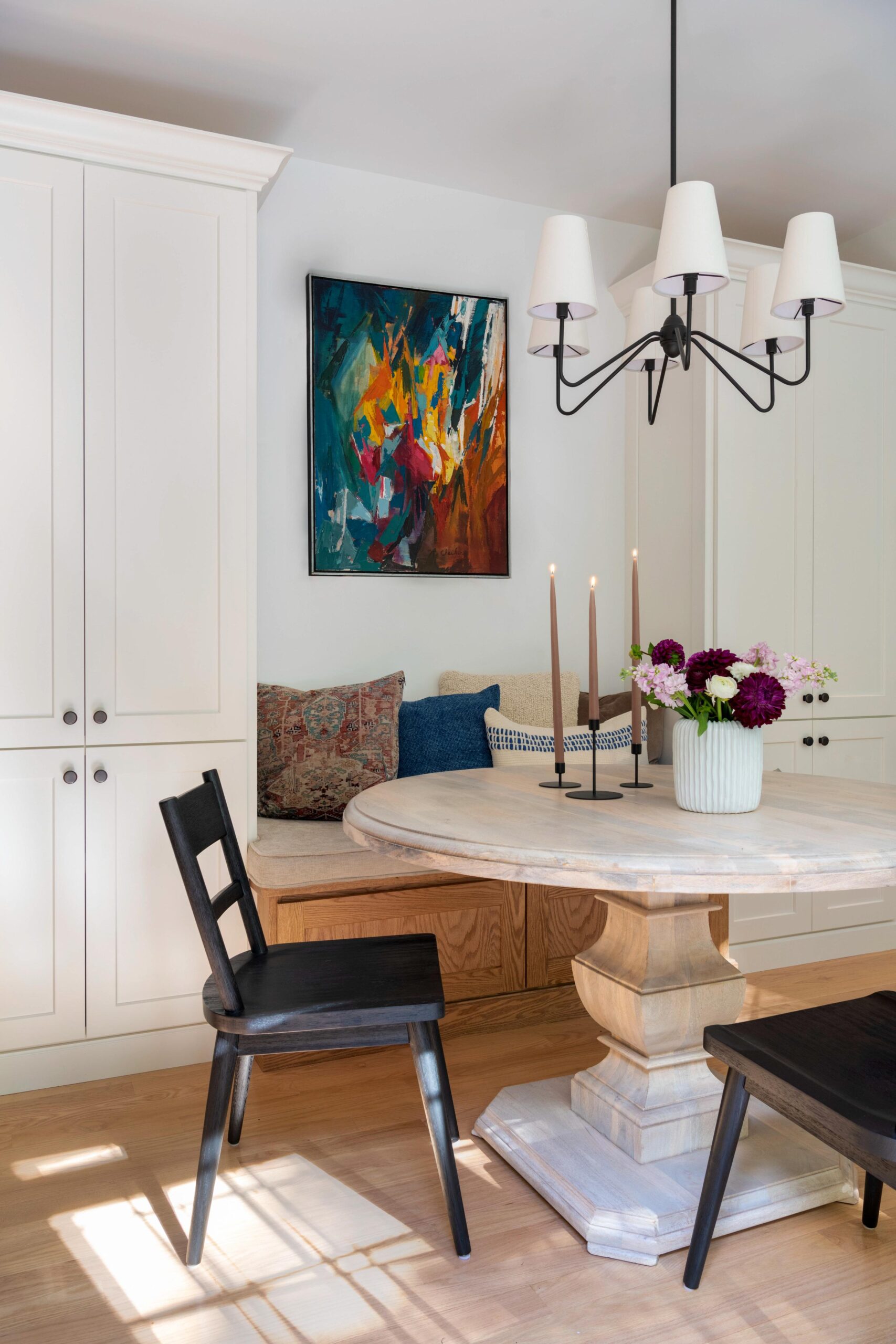
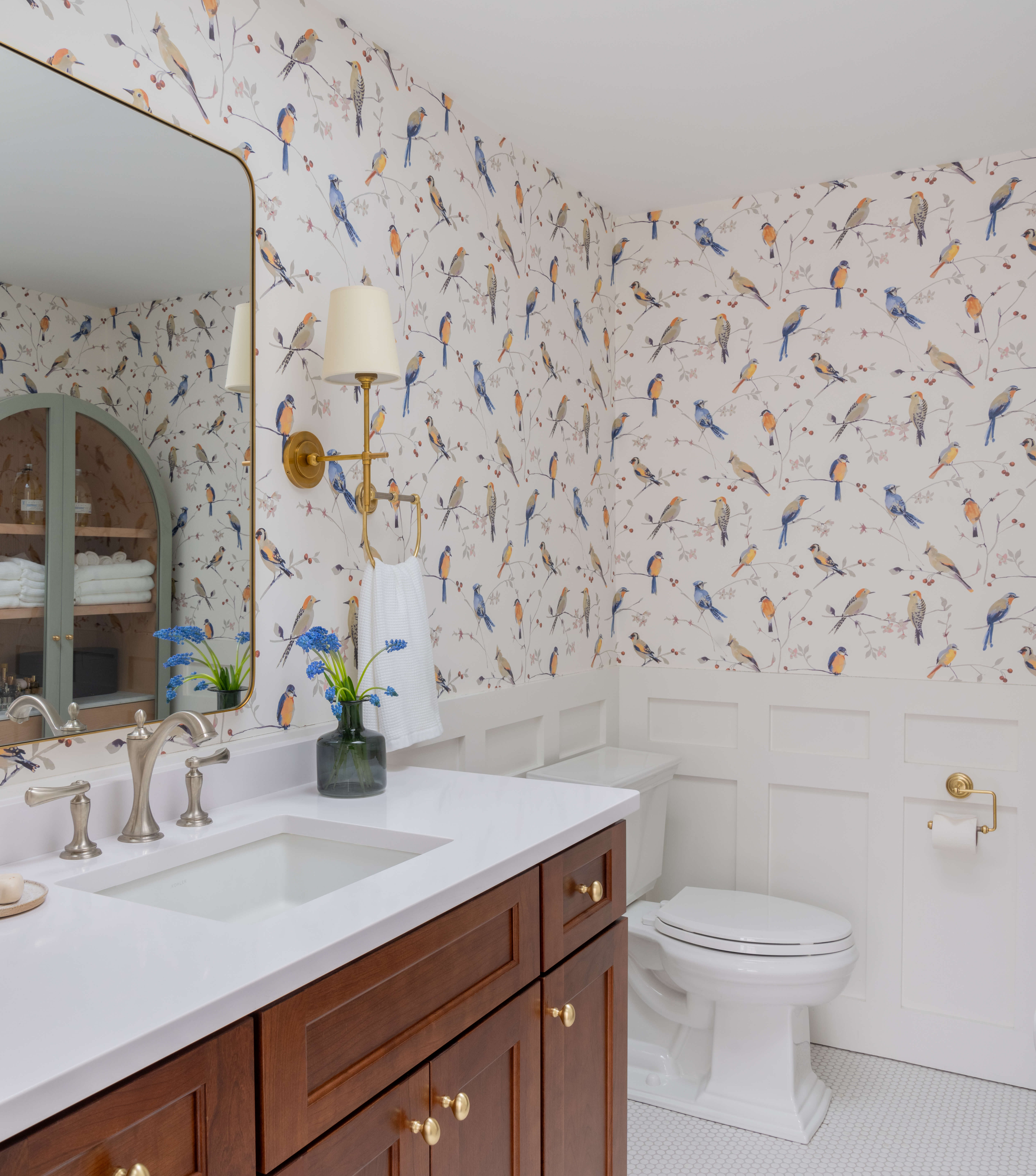
Accent colors can add personality and vibrancy to your home without overwhelming it. Consider using bold colors in smaller doses, such as on a feature wall, in artwork, or through decorative items like pillows and rugs. This way, you can enjoy pops of color without the commitment of painting entire rooms.
5. Consider the Lighting
Lighting plays a crucial role in how colors appear in your home. Natural light changes throughout the day, and artificial lighting can alter the perception of color. Test paint samples on your walls and observe them at different times to see how they look under various lighting conditions.
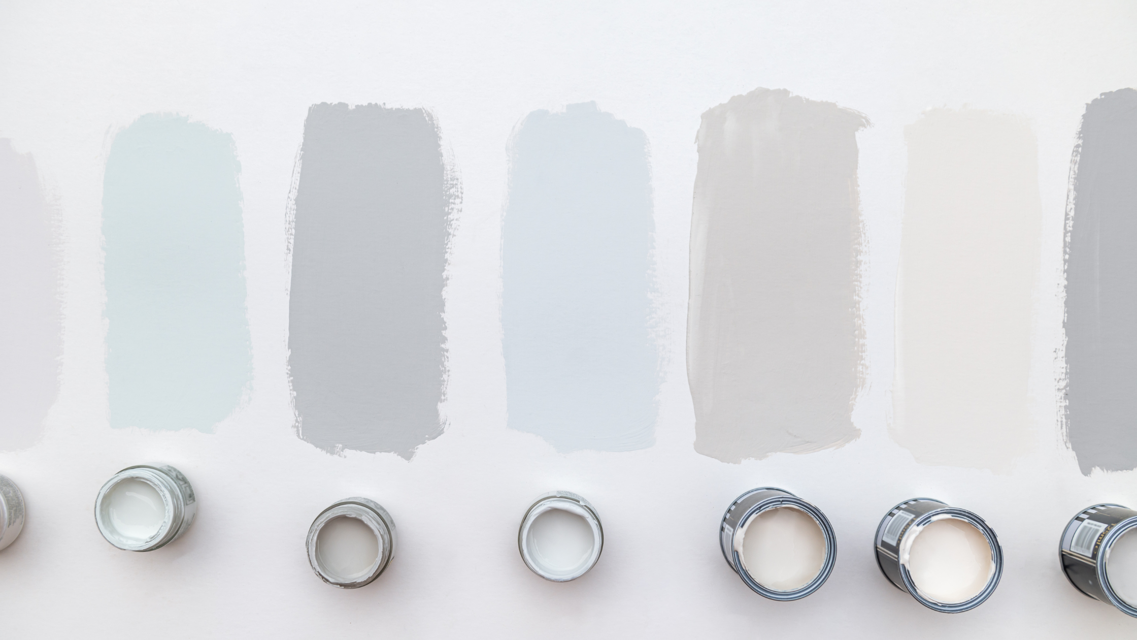
6. Follow the 60-30-10 Rule
The 60-30-10 color rule is a classic design principle that helps create a balanced and cohesive look. It suggests that 60% of the room should be a dominant color (usually a neutral), 30% a secondary color (complementary but more intense), and 10% an accent color (bold and eye-catching). This rule ensures a harmonious and visually appealing space.
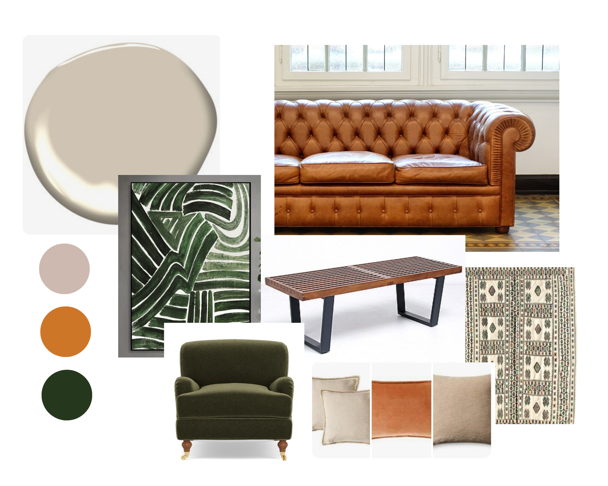
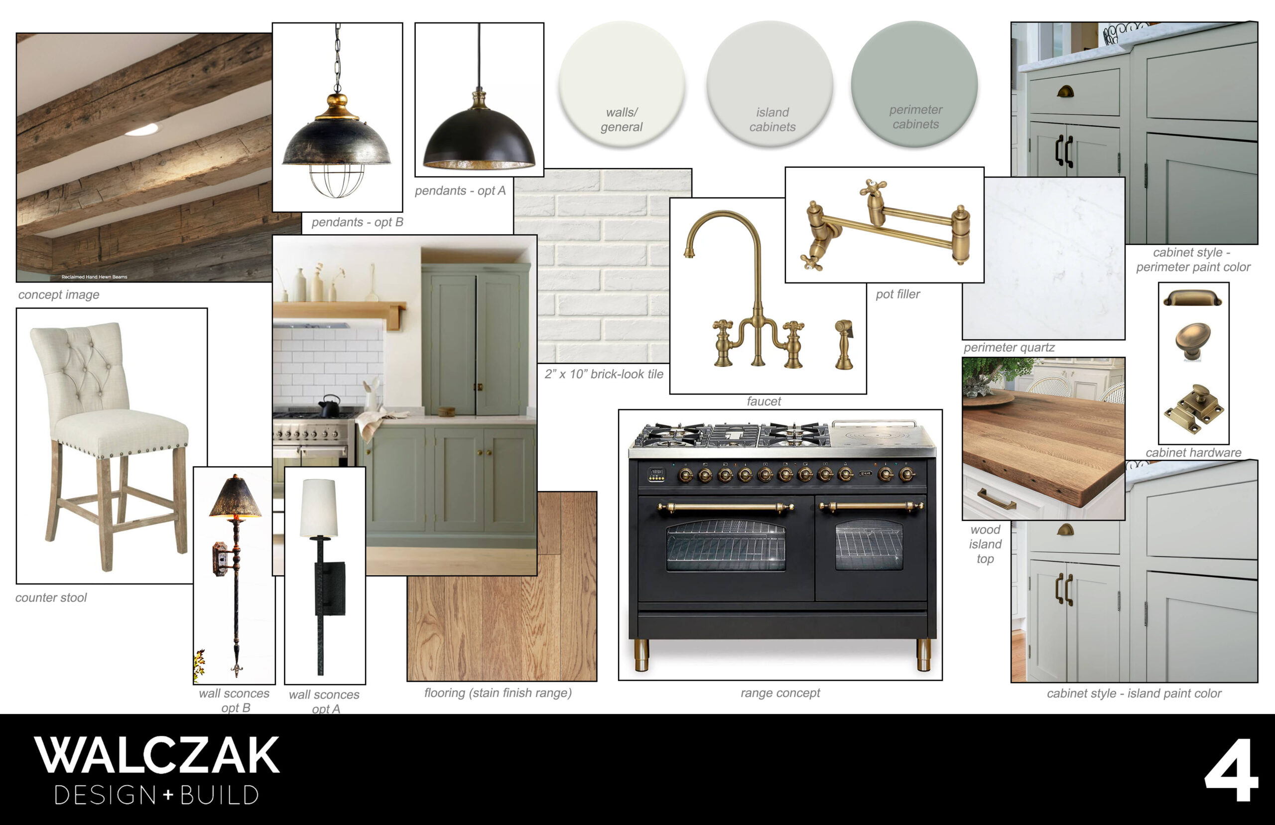
7. Create a Cohesive Palette with a Color Story
To ensure harmony throughout your home, choose a cohesive color palette. This doesn’t mean every room needs to be the same color, but rather that the colors complement each other and create a seamless flow from one space to the next. Crafting a color story for your home involves selecting a cohesive palette of colors that complement each other and creating a mood board to visualize how these colors interact. This approach can guide your choices in paint, fabrics, décor, and furniture, making the design process both fun and organized.
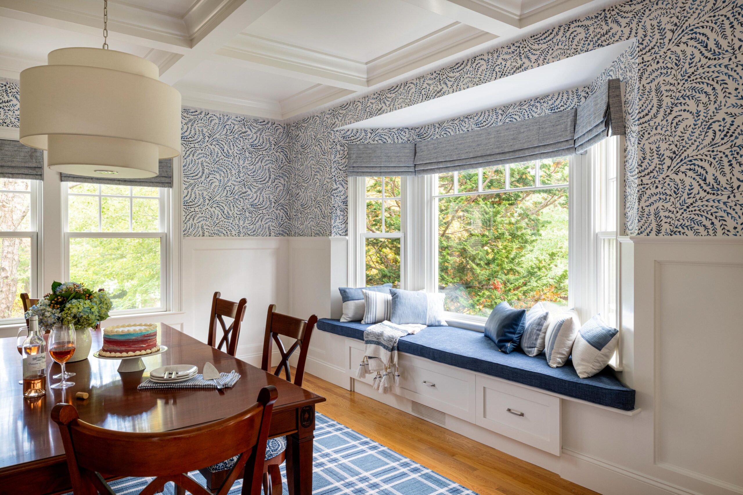
7. Think About Longevity
Trends come and go, but classic colors remain stylish. Consider timeless shades that won’t look dated in a few years. While it’s tempting to follow the latest trends, opting for enduring colors can save you from frequent repainting, like this blue and white dining room.
8. Personal Preference Matters
Ultimately, your home should reflect your personal taste. Choose colors that you love and that make you feel comfortable and happy. Don’t be afraid to incorporate your favorite shades in thoughtful ways that enhance your living space.
Why Choose Walczak Design and Build?
At Walczak Design and Build, our expert designers are here to help you navigate the world of color selection. We’ll work with you to understand your preferences and create a color scheme that enhances your home’s beauty and functionality. Whether you’re starting from scratch or looking to refresh your current space, we’re dedicated to making your home a place you’ll love for years to come.
Ready to start your home transformation? Contact us today to schedule a consultation. Let’s create a space that’s beautiful, functional, and uniquely yours.
Walczak Design and Build specializes in creating intentional and inspiring spaces on the North Shore of Massachusetts. Whether you envision a new kitchen, a lavish primary suite, a whole home renovation, or an ADU, our team takes a transparent and collaborative approach that truly sets us apart.

